CycleTimer is Windows based (no Mac) software that implements some of the time consuming and labor intensive techniques of Cowan and Gann. As the video on the home page shows, calculations are made in just a few seconds with the click of a mouse.
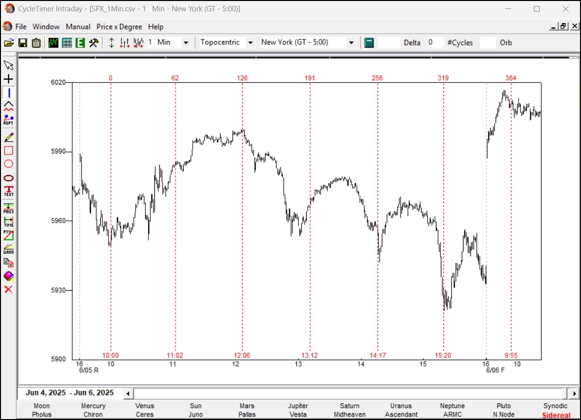
With unmatched precision measured in milliseconds, CycleTimer plots cycles on intraday charts down to one minute bars. This one minute chart of the SP500 shows how valuable topocentric cycles are for daytraders. The Cowan technique is the same for one minute bars as monthly.

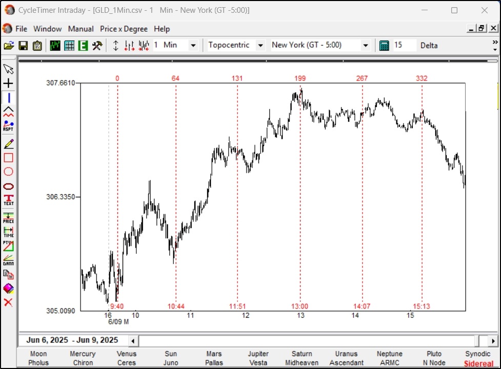
Cowan cycles work just as well in gold and any other freely traded market.
As with the preceding slide on the SP500, this one-minute bar chart of GLD was from yesterday. This assures that there is no 'cherry picking' data.
These cycles can be calculated into the future and used to help make your trading decision as these critical times arrive.

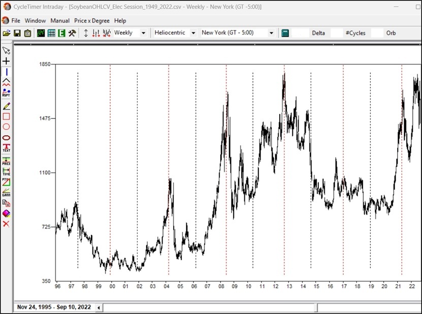
This 25 year weekly chart of soybeans shows another cycle Cowan discovered in the early 1980's. It has continued to repeat reliably for years.
Two cycles are plotted, the base cycle and its first harmonic. CycleTimer can plot as many cycles as desired.

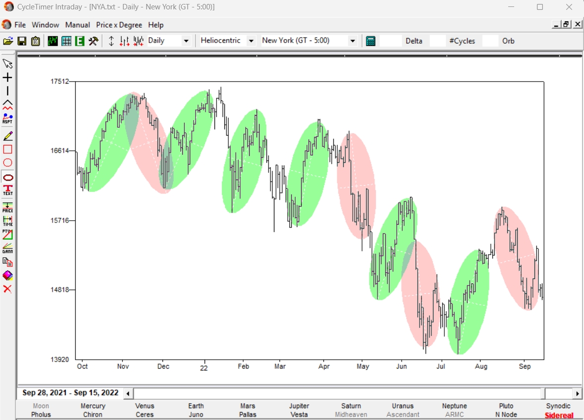
When finished drawing the ellipse you can edit its location, size, angle, etc to fine tune it to your market data. Then clone that ellipse and drag it to other areas of your chart to identify future price-time limits of your market.

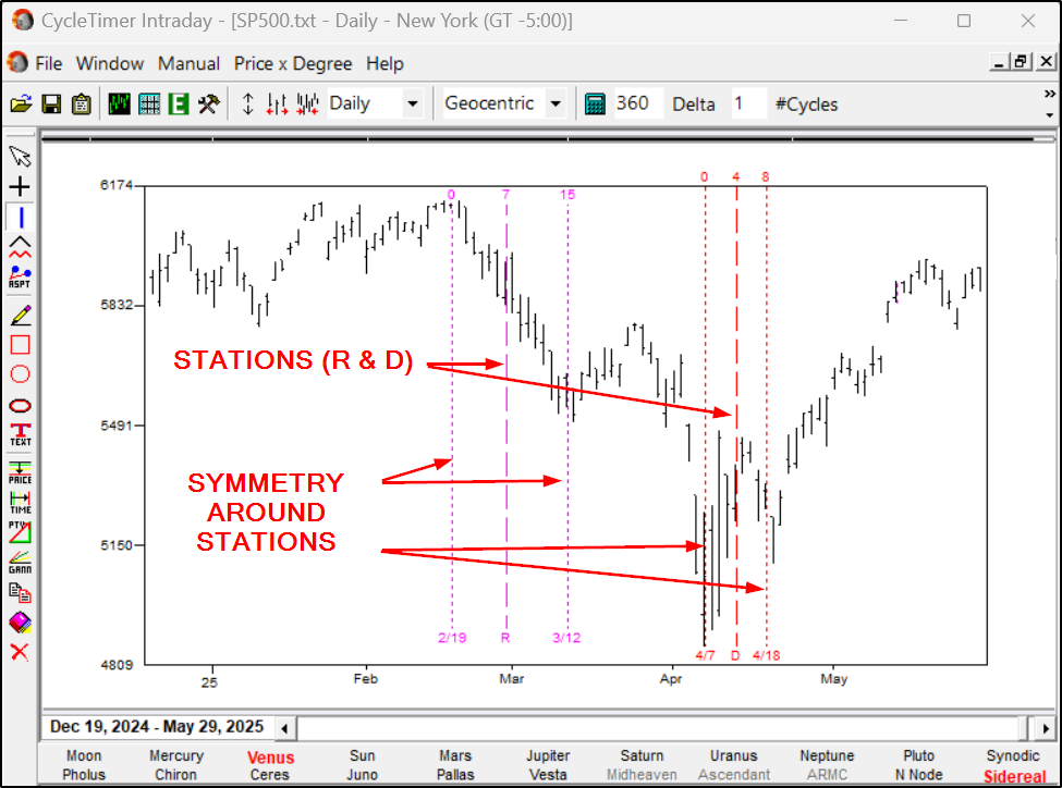
CycleTimer uniquely plots repeat aspects that occur around stations. For example, this chart of the SP500 shows how two recent turns were projected after the two retrograde (R) and direct (D) stations. The user simply drags his cycle crosshairs to a turn before a station (2/19 and 4/7) to project the high-probability turning points after the stations (3/12 and 4/18).

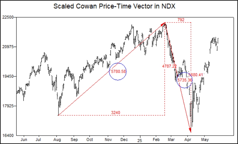
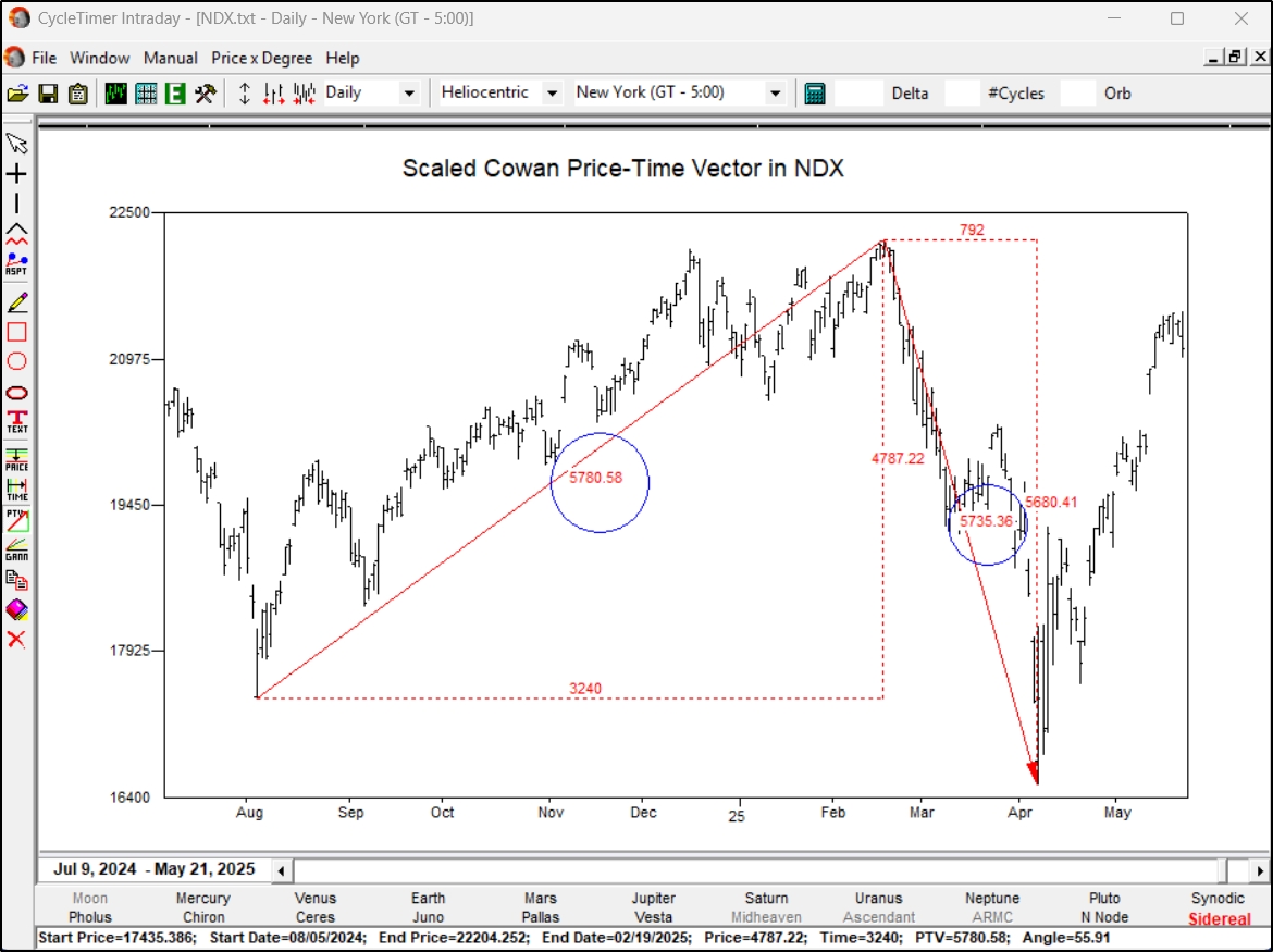
Whether you are working with Gann Angles or the Cowan Price-Time Vector, the axes must be correctly scaled. This chart correctly scales the axes.
All PTV data including angle, PTV value, price and time components are shown below the chart as the PTV is drawn.
This example of correctly scaled Gann Angles in the NDX stock index shows how the trend followed the angle into the February 2025 top. The 'tariff panic' then dropped down to the next lower angle. The value of these angles is seen with proper scaling.

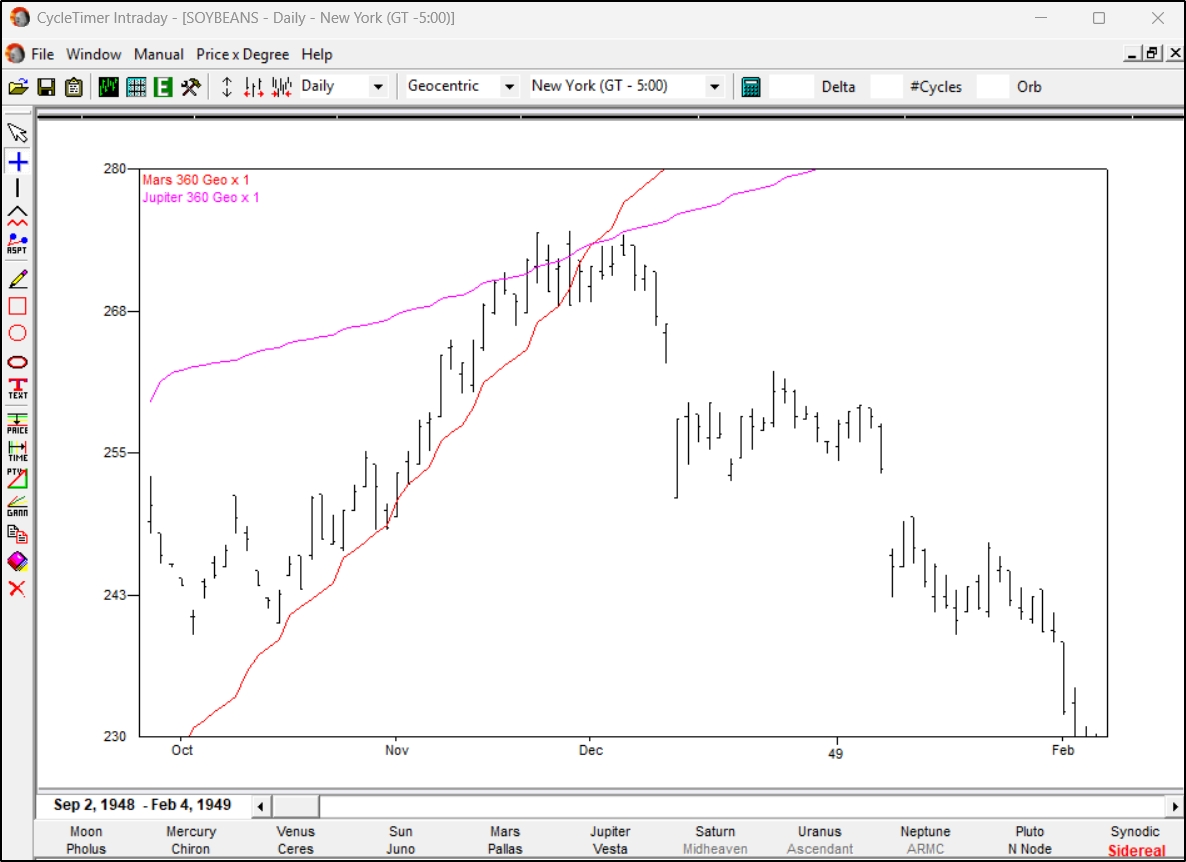
The next slide shows how easily CycleTimer plots Price by Degree by using this same May soybeans chart as an example.

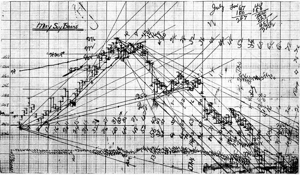
The previous slide showed Gann's personal chart of Price by Degree in 1948 May Soybeans. Gann plotted Jupiter and Mars by hand on his chart. This chart shows how easily CycleTimer plots Price by Degree.

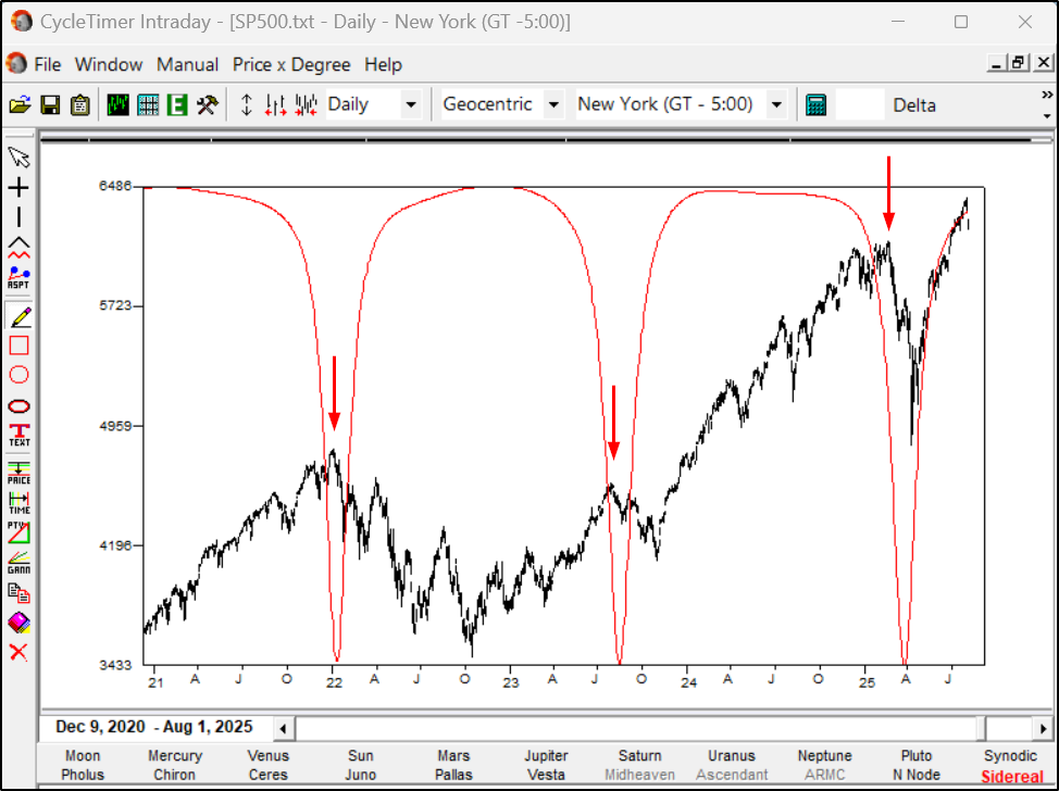
This was also demonstrated in the video, 'Planetary and Moon Nodes and Apsides in SP500'.
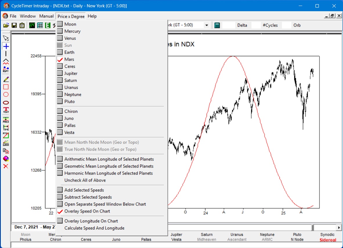
Any combination of bodies shown in this drop-down menu can be plotted on your chart. Gann's 'mean-of-five' and 'cycle of eight' can be plotted, as shown in the video, 'WD Gann Price by Degree'.

Speed can be plotted on the same chart with separate cycles showing how they interact.
Geocentric, Heliocentric, Barycentric, and Topocentric perspectives can be plotted.

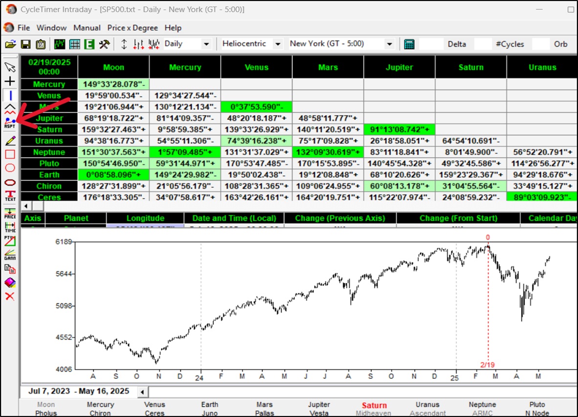
Knowing which planets are aspecting at important market turns tells you where to start your cycle analysis. This output shows the heliocentric aspects at the SP500 February 2025 top, just before the 'tariff panic'. Jupiter-Saturn were at 91+ and Mars-Venus were in conjunction. The + indicates the aspects were increasing, i.e., Jupiter-Saturn had already passed 90. Dark green highlights major aspects. Light green shows minor aspects.

Select the bodies to study. Check the box of the aspects or enter your own custom aspect in the box. The orb-of-influence applies a 'tolerance' for the aspect. For example, with orb set to 3 and the 90 aspect box checked, any aspect between 87-93 degrees will flag green. Dark green is for a primary aspect. Light green is for secondary.

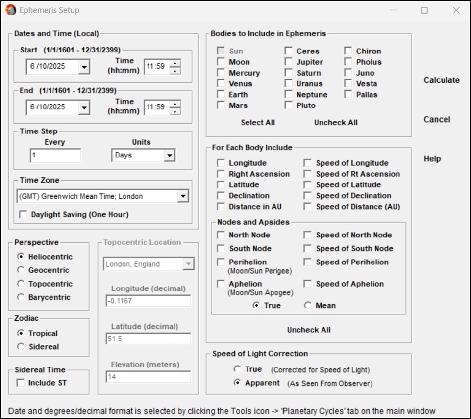
Speed of light is mostly useful when working with the outer planets and need very precise data. This can add a few minutes to your results.
